|
|
|
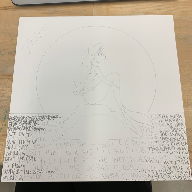
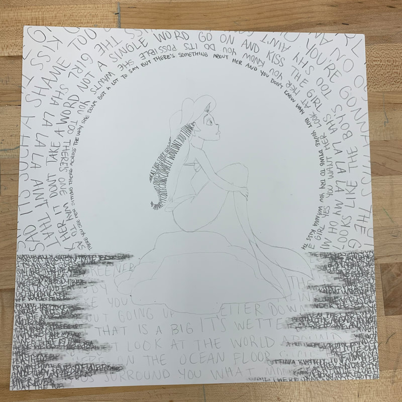
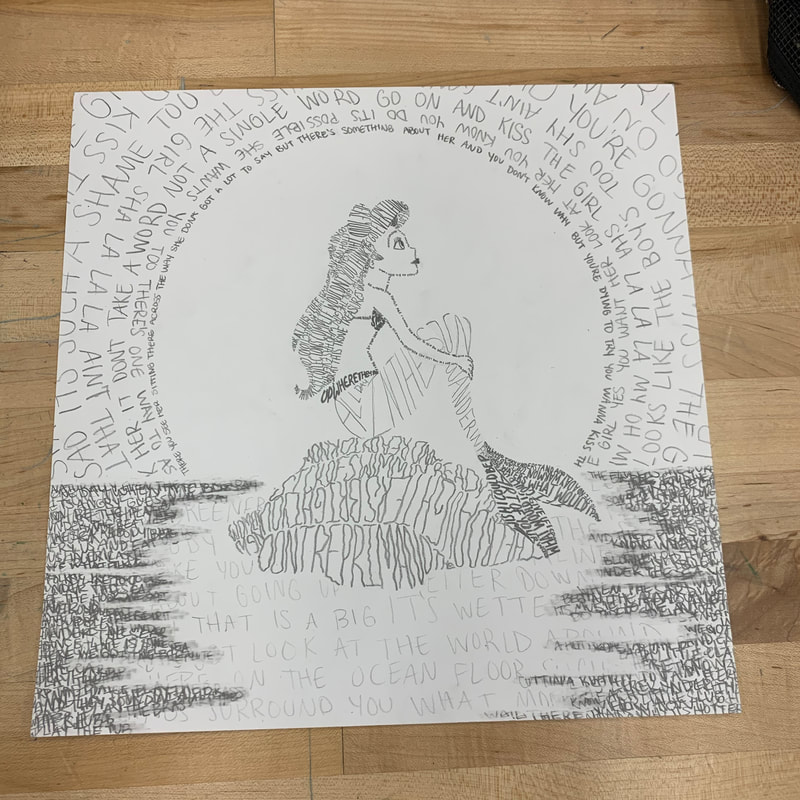
In creating my piece, I developed a better understanding of the value scale. I used song lyrics from The Little Mermaid and drew them in such ways to create a flowing image. My sister and I are huge Disney fans and we always sing along with the movies. Ariel is my favorite Disney princess so I had a lot of fun creating this piece.
I prefer handwriting over typography because I feel it allows me to express more of my personality. Typography also limits my creative ability because I can’t always find the font I want or manipulate it the way I want. With handwriting, I’m able to create fonts and change the text size all in a few strokes. Including words on a work of art can challenge the perception of the piece by making it appear more three-dimensional, textured, and giving the piece a clear, stated message. Andy Warhol’s soup can painting is a good example of text being used for more of a 3-D look. He uses the style of pop art that’s not realistic but more bold and by adding words, it creates the illusion of a cylinder without using shading and highlighting. Words can also appear to have texture. When creating my piece, I followed the natural curve of Ariel’s hair and used harder strokes where darker shades of hair would be. I layered words on top of each other in the sea, then erased around the edges to give it a smudged, water-like appearance. Though my art included song lyrics, many artists use words so people interpret their work in an intended way. My favorite part in drawing this piece had to be the rock. It was the most challenging to figure out how I was going to make it appear rigid and rough but I’m pleased with the result of my font. I also enjoy the look of the sea because I feel the smudges really give the illusion of water. |
